Pharmacy logo design: Designing a logo is considered a crucial and vital step in building the visual identity of a pharmacy, where the logo plays a decisive role in defining the brand identity and attracting customer attention. Uniqueness and distinction in logo design contribute to conveying a strong message about the pharmacy’s concept and character.
The attractive design of the logo reflects the characteristics of the pharmacy and its professionalism, showcasing its ability to provide healthcare services uniquely. From choosing colors and symbols to employing graphics innovatively, a well-designed logo embodies the values of professionalism and care for customer comfort. The logo design process has its challenges and requirements, as the design should be simple and easy to understand, while simultaneously delivering a powerful message and highlighting the pharmacy’s uniqueness among competitors. Therefore, designing a pharmacy logo is a vital step towards building a strong and appealing visual identity for customers.
How to choose colors that reflect the healthy and professional character of the pharmacy logo
Choosing the appropriate colors for a pharmacy logo plays a crucial role in defining the healthful and professional character of the pharmacy. Here are some guidelines for selecting suitable colors:
- Use of green: Traditionally associated with nature and health, green reflects a pure and calm character, creating a sense of comfort and tranquility.
- Use of blue: Linked to trust and stability, the color blue signifies professionalism and calmness, making it suitable for healthcare pharmacies.
- White and light blue: A combination of white and light blue can indicate purity and cleanliness, reflecting an elegant and professional design.
- Natural colors: Opting for colors inspired by nature, such as olive green or light brown, adds a healthful allure, demonstrating a commitment to healthcare in a natural way.
- Avoid overly bright colors: Steering clear of excessively vibrant colors that may give an impression of restlessness is recommended. It’s preferable to use subdued and soothing color shades.
- Commitment to a specific color palette: Choosing a defined color palette that aligns with the pharmacy’s goals and vision contributes to conveying a sense of integration and professionalism.
- Test colors on small shapes: Ensure that the colors appear well on a small logo, as it may be displayed in a reduced size on signs or documents.
- Rely on harmony: Ensuring harmony among the selected colors and avoiding conflicts relies on balancing the color scheme, contributing to a polished and attractive logo.
With special attention to color selection, a pharmacy logo can have a positive impact on customer impressions and enhance the visual identity of the pharmacy.
“read more about How do you differentiate your pharmacy?“
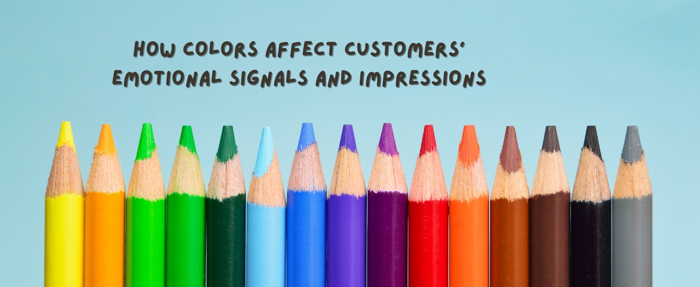
How colors affect customers’ emotional signals and impressions
Colors have a significant impact on the signals of emotions and impressions among customers, playing a vital role in shaping the customer experience and influencing their decisions. Here’s how colors can affect emotions and impressions:
- Red:
Emotions: Associated with passion and excitement.
Impressions: Encourages vibrancy, used to grab attention, and may enhance feelings of energy and enjoyment. - Blue:
Emotions: Linked to calmness and trust.
Impressions: Reflects professionalism and stability, used to convey impressions of trust and calmness. - Green:
Emotions: Associated with growth and renewal.
Impressions: Enhances natural and health-related impressions, making people feel refreshed and balanced. - Yellow:
Emotions: Associated with joy and vitality.
Impressions: Encourages positivity and optimism, used to create an atmosphere of joy. - Purple:
Emotions: Linked to luxury and mystery.
Impressions: Enhances impressions of luxury and beauty, used in designs aiming to attract attention. - Orange:
Emotions: Associated with warmth and enthusiasm.
Impressions: Enhances brightness and positive energy, used to create a warm and cheerful atmosphere. - White:
Emotions: Linked to purity and cleanliness.
Impressions: Feels simple and clean, used to promote calmness and relaxation. - Black:
Emotions: Associated with strength and allure.
Impressions: Feels elegant and beautiful, used to express sophistication and impact.
Colors hold a crucial place in brand design and marketing. Understanding the impact of each color helps in better communication with your customers and achieving a positive effect on their experience.
“read more about Pharmacy marketing”
How the name of the pharmacy can be beautifully combined with the chosen (Pharmacy logo design) symbols

To seamlessly integrate the pharmacy name with the selected symbols in the logo design, the following steps can be followed:
- Choose Elegant Fonts: Select fonts that reflect professionalism and beauty. The name can smoothly integrate into the symbols with stylish fonts.
- Adjust Size and Harmony: Ensure that the size of the name is proportionate to the symbols, maintaining balance and harmony between them.
- Use Colors Thoughtfully: Choose colors that harmonize with each other and convey a healthful character. Colors should help highlight both the name and symbols.
- Integrate Symbols with Characters: Design the symbols in a way that integrates with the characters of the name, creating an impression that they are an inseparable part of the design.
- Text and Symbols Interaction: Achieving a beautiful interaction between text and symbols can effectively capture attention.
- Simplicity and Clarity: Avoid adding unnecessary details and steer clear of complexity. Simplicity and clarity make the design more attractive.
- Test and Adjust: Test the design on various backgrounds and situations to ensure its clarity and beauty. Make necessary adjustments if needed.
By implementing these steps, a beautiful and effective integration between the pharmacy name and the selected symbols can be achieved in the logo design.
How to innovate in representing medical symbols in an elegant and inspiring way

To represent medical symbols elegantly and inspirationally in logo design, the following guidelines can be followed:
- Use Common Medical Symbols: Incorporate symbols that are commonly recognized in the medical field, such as the medical cross, medical book, or medical caduceus.
- Add Artistic Touch: Integrate artistic elements that add dimensions to the symbols, making the design more creative and elegant.
- Fine Details: Adding fine details to the symbols can enhance the aesthetics of the design. The details should be simple yet expressive.
- Utilize Colors: Use colors that reflect the medical character, such as calming blue, green, or white. Avoid overly vibrant colors that may not be suitable.
- Define General Shape: Choose a general shape for the symbol that aligns with the pharmacy’s character, whether it’s circular, square, or geometric.
- Connect Symbols to Pharmacy: Directly or indirectly link the symbols to the pharmacy, reflecting medical and health-related activities.
- Uniqueness and Creativity: Explore unique ways to present the symbols differently from common designs, fostering innovation.
- Symbolic Icons: Utilize symbolic icons that represent modern technologies in the medical field, such as LED lights or medical technology.
- Visual Impact: Use visual effects like shadows or gradients to give a three-dimensional and elegant touch to the symbols.
- Leverage Fonts: Select smooth and elegant fonts that enhance the aesthetics of the symbols.
With the diversity in the medical field, innovating in the representation of medical symbols can be an opportunity to achieve a unique and beautiful design.
What are the types of fonts used in designing a pharmacy logo?
Google Fonts provides a wide range of free fonts available for use. Here are some examples of popular fonts that can be found on Google Fonts:
1. Roboto
2. Open Sans
3. Montserrat
4. Lato
5. Source Sans Pro
6. Poppins
7. Raleway
8. Nunito
9. Quicksand
10. Ubuntu
You can browse Google Fonts and choose the fonts that suit the logo design you want to create. Afterward, you can download the fonts and use them in graphic design software such as Photoshop.
“read more about digital marketing agency egypt”
How can aspects of the website be used in logo design?
Utilizing elements of the location in logo design can have a positive impact on representing the pharmacy. Here are some ways you can use:
- Medical Cross Integration: Gradually incorporate a medical cross into the logo design to associate the brand with the concept of healthcare and pharmacy.
- Medical Science Symbol: Integrate common medical symbols such as the medical science flag into the logo to distinguish and identify it as a pharmacy.
- Integrate Pharmacy with Local Structure: If the pharmacy is situated in a specific area, you can draw or integrate the local map to represent the location.
- Use Natural Symbols: Use natural symbols related to the location, such as distinctive trees or mountains, to enhance the local identity.
- Integrate Area Colors: Use colors that reflect aspects of the local nature or environment to integrate the logo with the location.
- Unique Architecture: If there is a unique building for the pharmacy, you can incorporate the distinctive features of this building into the logo.
- Local Patterns: Use patterns or designs inspired by the local culture to promote distinctiveness.
In the end, it’s important to elegantly and inspiringly combine local elements in logo design to reflect the unique identity of your pharmacy and its place in the community.